Kube & Pill brand
Logo
Never delete the default cube
A cube and a pill. These were the default shapes in 3D software, the first ones you added to an empty scene. They were also my very first steps as a creative.
The logo mixes the two and uses negative space to build the volume and the outline of each shape. It is responsive and changes form depending on the size it is displayed at. At very small sizes, only the outline of the pill remains, inside a filled cube.
Colors
Neither red nor orange
I could not choose, so I kept the in-between. The whole palette follows the same idea: bold colors. The greys are nothing special. They are just a little warmer than usual, because I like people to feel welcome.
Grid
Exploring projects differently, with an interactive grid designed as a game
Everything starts from the user experience. The constellation is an interactive system designed as a discovery game, another way to browse my projects. Each element follows precise rules of color and icon, but together they create a cryptic universe you want to explore.
A dark, acid visual language where every color and every icon has a role
Dark mode had to be the default, which makes sense when you work with the shutters closed. Each color matches a type of project and carries its own icon. The orange cube for case studies. The green capsule for experiments, the projects I make for myself, creative or not. Lavender for collaborations with agencies and projects I contribute to, with a shape missing one piece: the one I bring.
Font
Kube & Pill
One typeface across the whole site: Dwight, a geometric sans serif designed by Lift Type, a type foundry based in Montpellier. Inspired by traditional office tools like perforated paper, it brings unusual details that balance out the raw, tech look of the site. Its geometric forms keep everything rigorous, from headlines down to captions. A choice guided by the advice of Alexandre Créquer, type designer and graphic designer.
Dwight Box
Dwight Box is generated from Dwight by a Python algorithm: every letter is replaced by a solid rectangle, as tall as the original letter and as wide as its advance width, with a slight bleed so the boxes touch and form a single bar. Spaces stay spaces, and advance widths and kerning do not move. Any text can become a graphic block that matches its exact shape, without changing the layout.
Design & Motion system
One concept to rule them all
Motion unfolds to the user like a red carpet. The grid comes back everywhere, and the pixels suggest decryption, as if the site revealed itself bit by bit. Everything is a story of pixels and blocks, just like the way I work: moving forward one small step at a time, building reusable design systems, and fitting it all into a single idea.
Long pressMove & hold click
Voice & Tone
My voice is &
Unwrapping the UVs, carefully...
The seriousness stays in the work, and the humor slips into the details. People who browse with a screen reader deserve the jokes too.
Imagery
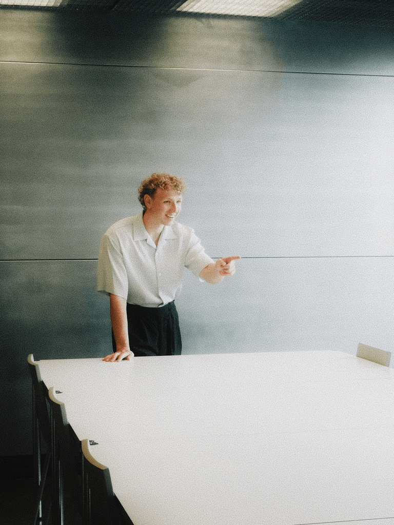
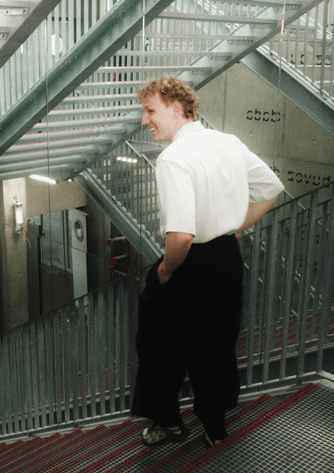
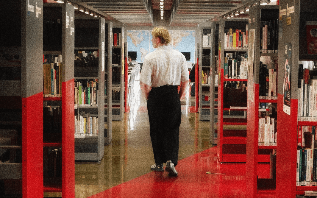
No books were opened during this shoot
Photos are by Aurélien Thomas, as talented in photography as he is in 3D. He agreed to take my picture between two good bowls of ramen at home. Our playground: the Médiathèque André Malraux in Strasbourg, a historic building modernized by architects Jean-Marc Ibos and Myrto Vitart. A very serious setting, which clashes with my temperament.
Sound design
Move me around
Sound you can almost touch
The melody reinforces the mysterious, cryptic mood of the site. Sound effects also add a layer to the experience: every action answers back, with almost haptic feedback. Made by the talented Adrobski (Bangalter was too busy).
Thanks for reading all of it, down to the last pixel. You now know what goes on behind the scenes. Time for the projects.